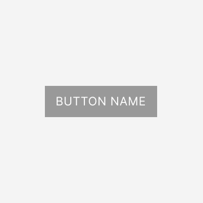
Button
- Usage
- React
- Accessibility
Button is an interactive element that triggers actions or submits information. Use buttons to help users complete key tasks like form submission, saving, or navigation between steps.
When to use
Use Button
- to submit a form
- to save changes or commit data
- to move forward or backward in multi-step processes
- to trigger an important action
- to dismiss or cancel
When not to use
Do not use Button in the following situations:
- to navigate users to another page or URL.
- for icon-only buttons. Use IconButton instead.
- for binary on/off settings. Use Switch or Checkbox instead.
- to choose one item from a group. Use RadioField or RadioGroup instead.
- to select multiple items. Use Checkbox instead.
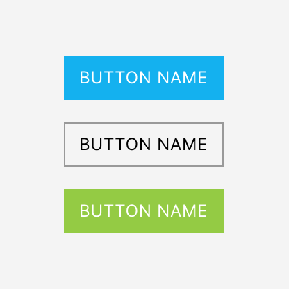
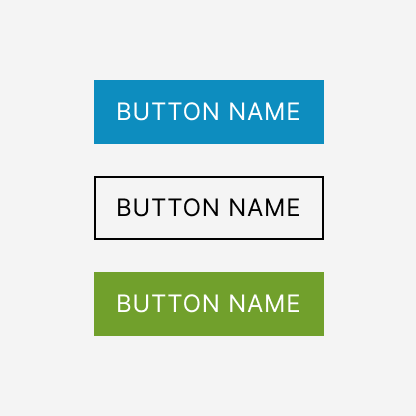
Variants and behavior
Variants
Button has 4 variants. The default variant is primary.
Limit each container to one primary, one action, and one destructive button. Add secondary buttons when you need additional actions.

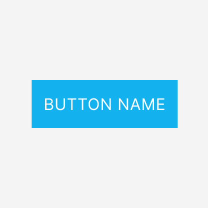
Primary
The primary variant is the main call-to-action button. Use it for the most important action on a page.
Use the primary variant:
- to trigger the most important action
- to submit a form
- to progress to the next step
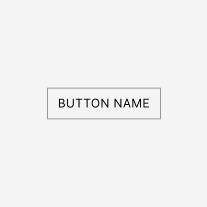
Secondary
The secondary variant is for less critical actions that complement the primary action without drawing as much attention.
Use the secondary variant:
- to cancel a form
- to access additional information
- to navigate to a different section
- when you need multiple buttons alongside
primary,action, ordestructivebutton
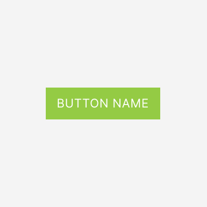
Action
The action variant commits changes or saves data. Use it only to save operations within forms or interfaces. Do not use it for other purposes.
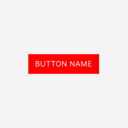
Destructive
The destructive variant warns users that the action may cause data loss or cannot be undone.
Use it for deletions, removals, or account cancellations.
Size
Button has 3 sizes with md as the default.
Use different sizes to create visual hierarchy, match surrounding elements and the layout context.
lg: for prominent actions or layouts with larger touch targetsmd: as the standard size for most interfacessm: for compact layouts or inline actions
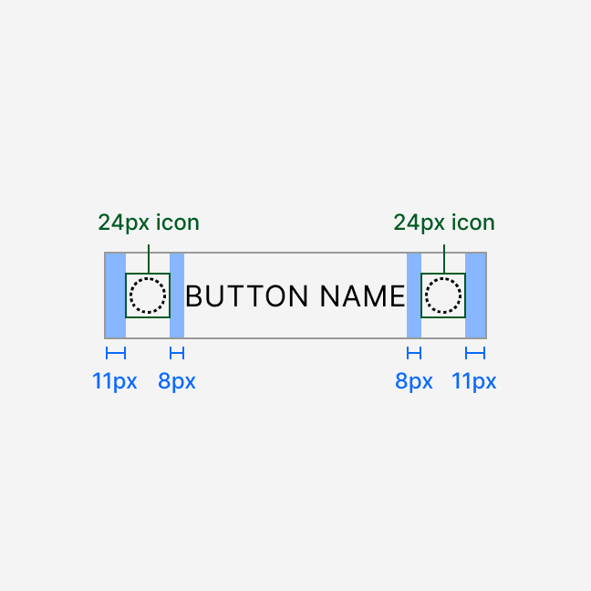
Icons
Use icons in buttons to help users understand the action faster.
Icons should complement the text label, not replace it. If you need a button with an icon only, use IconButton instead.
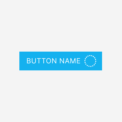
States
Button has 4 states. The default is enabled.
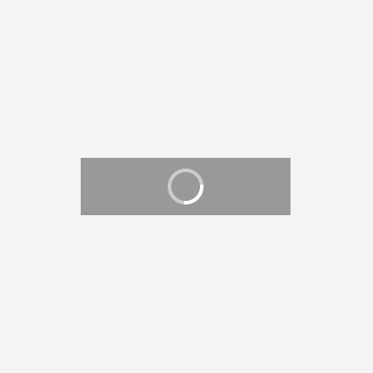
Do not rely on disabled or isLoading alone to explain why an action is unavailable. Always make the reason clear to users when a button is disabled. You may provide that context through helper text or a tooltip.
Interaction
Clicking Button sends a request and executes an action. Actions have 2 timing patterns.
- Immediate actions (under 1 second): no visual change occurs
- Asynchronous actions (1 second or more): the button enters isLoading or disabled
The button cannot be clicked again until the action completes.
Alignment and grouping
Button groups in modals, alerts, messages, cards, and multi-step processes must contain only one principal button (primary, action, or destructive).
Use secondary for all additional buttons in the group. Standalone buttons may use any variant.
Avoid 3-button groups in modals, alerts, messages, and cards. Use 3 buttons only when a multi-step process requires it.
Always use an 8 px gap between buttons in a group, both vertically and horizontally.
When designing in Figma, use the Figma-only ButtonGroup component. It ensures correct spacing and button order.
Missing (TBD):
- The exact breakpoint for switching between layouts (large/small displays)
- Spacing between buttons, specific spacing tokens used between stacked buttons. E.g. “A group of buttons uses token
gap-button-group(8px) for spacing when...”
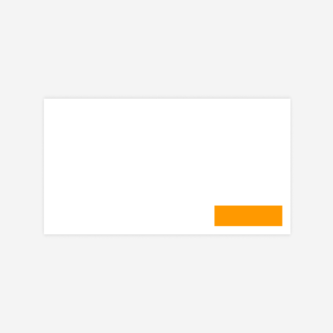
Right alignment: modals, alerts, messages
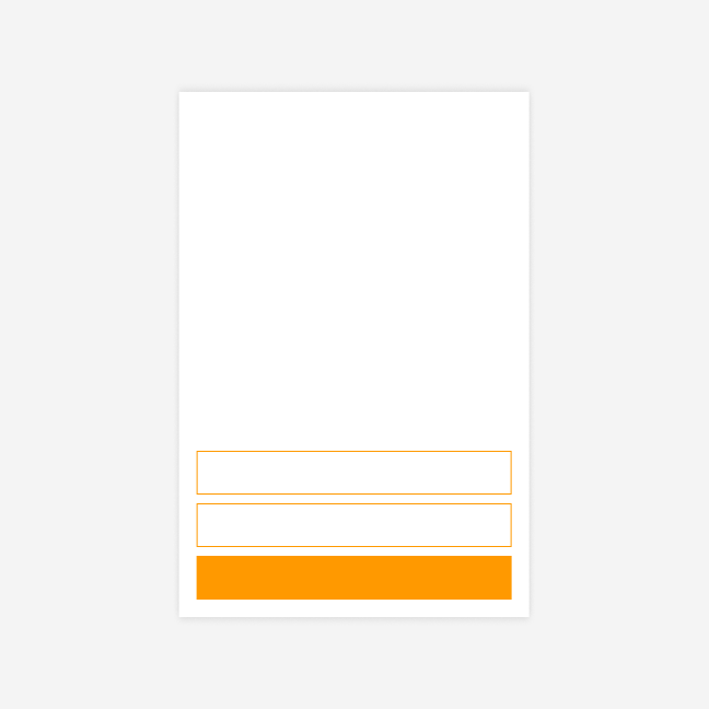
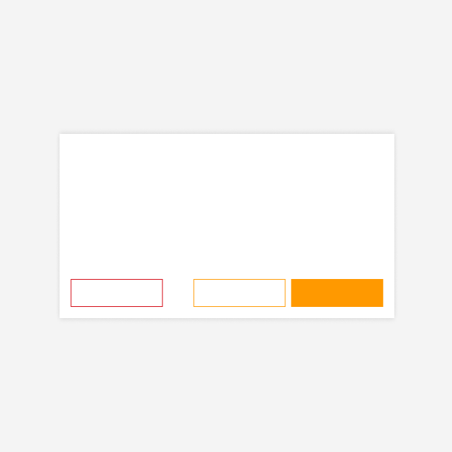
In modals, alerts, and messages, place the principal button (primary, action, or destructive) on the right. Place secondary buttons to its left.
One button
Two buttons


Three buttons

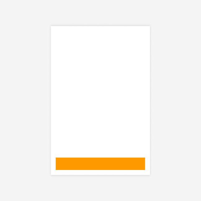
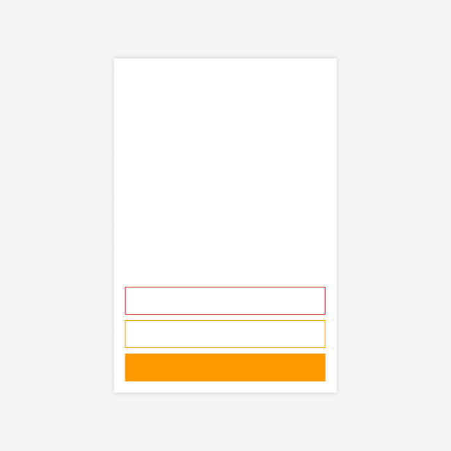
Left alignment: cards
In cards, place the principal button on the left. Place secondary buttons to its right.
One button


Two buttons
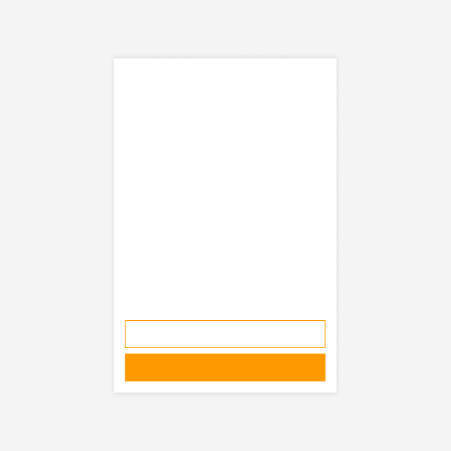
Three buttons


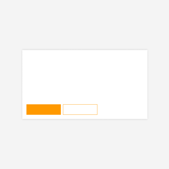
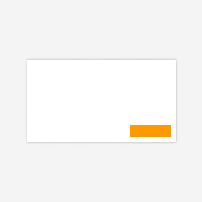
Left-right alignment: multi-step processes
In multi-step processes or flows, place the forward action (primary button) on the right. Place the backward action (secondary button) on the left. Do not group two buttons on the left side.
Two buttons

Three buttons
If you need a destructive button in a multi-step process, place it on the left side, separated from the other buttons.


Separating the destructive button from primary and secondary buttons prevents accidental clicks on dangerous actions.
Responsiveness
Button groups adapt to small screens by stacking vertically. In modals, the principal button (primary, action, or destructive) moves to the bottom for better thumb reach. In cards, it stays at the top.
TBD
- The exact breakpoint for switching between layouts (large/small displays)
- Spacing between buttons, specific spacing tokens used between stacked buttons. E.g. “A group of buttons uses token
gap-button-group(8px) for spacing when...”
Anatomy
Button sizing and spacing depend on the selected size. All labels render in uppercase.
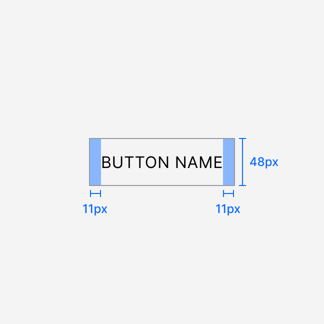
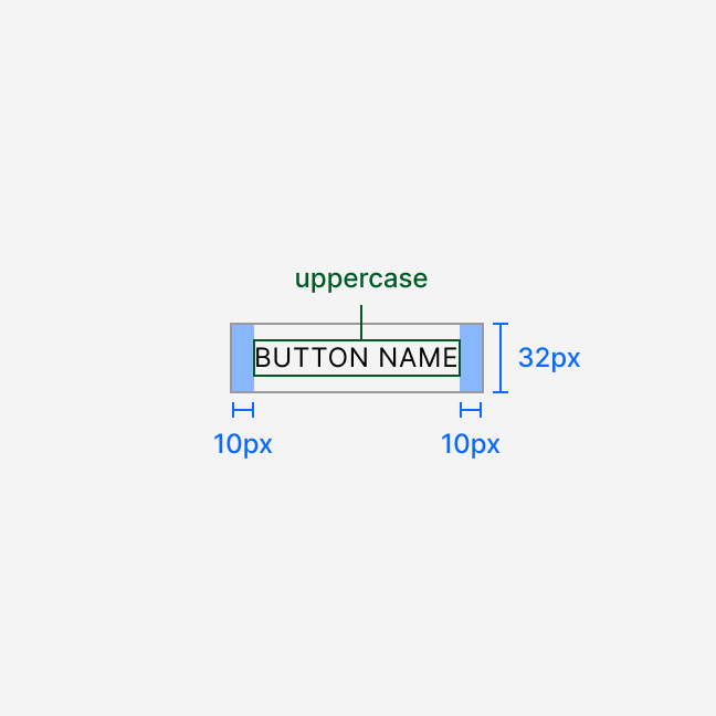
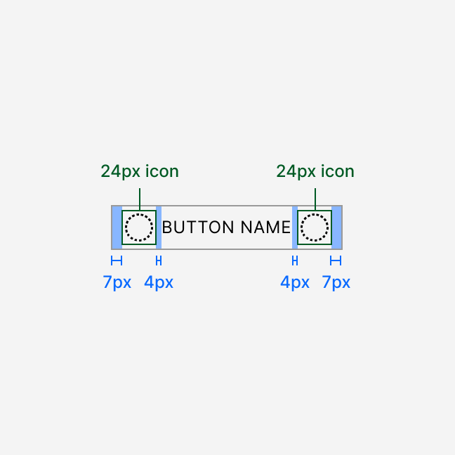
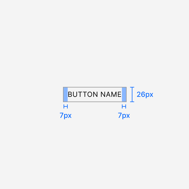
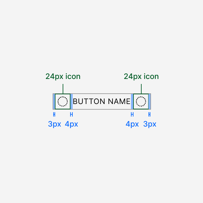
The secondary variant has a 1 px border and transparent background. All other variants have a solid background and no border.
Content
Write button labels using imperative verbs. Keep them short. The component renders all labels in uppercase.
- Describe the action (Delete, Save, Submit)
- Use a verb for
primarybutton labels - Do not use generic labels such as "OK" or "Proceed" for
primarybuttons - Do not use pronouns such as "you"
You may use general words for secondary buttons. These include adverbs and particles for complementary pairs (Back, Next) or short phrases (Advanced settings).
Use an ellipsis (…) at the end of a label when the button opens a configuration page, starts a wizard, or triggers a follow-up action.
Related
- IconButton: Use when you need a button with only an icon
- Checkbox: Use for multiple selections
- RadioField or RadioGroup: Use for single selection from a set
- Switch: Use for binary on/off settings
Usage in code
To implement Button component add the import:
import { Button } from "@shoptet/ui";
After adding import use it simply like:
<Button>Hello World!</Button>
Live Example
<Button>Click me!</Button>
Button meets WCAG 2.2 Level AA requirements. For complete accessibility guidelines, see Accessibility.
Keyboard
- Pressing
EnterorSpacetriggers the button action - Users reach buttons with
Tabnavigation - The focus state must stay clearly visible
Screen readers
- Use the semantic
<button>element. Do not use<div>or<span>with click handlers. - The button text serves as the accessible name
- Avoid adding
aria-labelwhen the button already has text - Use
aria-busy="true"during theisLoadingstate
Missing: isLoading disables the button. Confirm whether aria-busy="true" is the implemented approach or if another ARIA pattern is used.
Button targets must be at least 24×24 CSS pixels or have sufficient spacing from adjacent targets. See Touch Target Size for details.